A blog from Visual Jill, East Bay Interior Design

A blog from Visual Jill, East Bay Interior Design
Showing posts with label bright colors. Show all posts

Friday, April 19, 2013

Staging a family home

This week we staged a completely renovated bungalow in Oakland's NOBE area. As usual, the developers did an amazing job reconfiguring and restoring the space to make it more livable, while keeping the original trim and charm.


Staging is all about literally "setting the stage" for potential buyers so they can envision themselves living in the home. Because this is a large, 4-bedroom house, we needed to stage it as a family home. This means making it seem comfortable and inviting for kids as well as their parents. Here's how we did it.

Strategic color choices
We chose bold colors to bring energy to the rooms that are specifically for kids. Check out the downstairs playroom, with the unexpected and bright combination of turquoise, orange, hot pink and green. It practically screams "Get in here and play!"


And in the kid's bedroom, we chose a sunny yellow with pops of color in artwork and accessories.


The nursery also boasts fun colors and an eye-catching stripe detail.


In the adult-centric living room and office, we worked with brighter furnishings against more neutral gray and white walls. The black and white additions add a bit of surprise.


Kid-friendly details
We sprinkled kid-friendly artwork and accessories throughout the home to make it clear that this is a place meant for families.

For example, we created a gallery on the family room's chalkboard wall by mixing hand-drawn frames with basic wood frames to showcase kids' artwork.


And check out one of the colorful collages by artist Mati Rose McDonough that we hung in the kids' room. Artwork makes all the difference -- in staging and decorating!


Our kids accessories also included a skateboard and play guitar, along with plenty of games and toys. When you stage (or decorate!) with the key audience in mind, you'll always get it right.

For those of you with kids, what do you do to make your own home family-friendly? How do you decorate with the kids in mind? Tell us in the comments below.

Thanks to Lisa Ratner for the photographs!


Monday, February 11, 2013

Making a small home live big

Are you familiar with the saying "Less is More"? Well, last week we staged a home that really exemplifies this statement. The builders made such efficient use of the limited space that they were able to include an office, a game room, and a great outdoor area in addition to the two bedrooms, 1 bath and living room/dining room.

We chose our paint and decor color palette carefully to create an easy flow between the different sections of the house.

All photos courtesy of Lisa Ratner.


The front door opens into the living room, where we used a soothing mix of blue, grays and whites.


From the living room you can look past the beautiful wood columns (with closets inside!) into the dining room, kitchen and office. The blues, grays and whites continue, with an unexpected splash of yellow in the office.


The full chalkboard wall in the office is a fun (and useful) detail.


The two bedrooms are small but packed with character. We think the bright accent walls make the spaces have a bigger impact.


As great as the inside of the house is, it's the back deck, patio and plus room that really make it stand out among other small bungalows in the area.


The deck is accessible via french doors from the office or the master bedroom.


From the deck stairs you enter a good-sized patio that includes vegetable beds. It leads into the bonus room (doors on left), which is next to the garage.

Here's the diagram of the layout, where you can really see how well the space is used.


We are so impressed that such a small home can feel so spacious and livable.

Wednesday, January 30, 2013

We love CB2's lookbook

Have you visited CB2 lately? We think they got it just right this season -- great colors, shapes and textures. Their latest catalog is full of inspiration -- here are some of our favorite spreads.

This photo shows how you can use bold and modern items in an older home with wood trim and details. The juxtaposition of old and new is exciting and fresh.

We admire how they've mixed colors here -- cool and warm tones against a neutral gray wall. The artwork ties everything together.

On an opposite note, these white walls and other neutrals get just a pop of color from the fabulous new green sofa. The expert mixing here comes in the form of texture -- sleek plexiglass, rich leather, painted wood and smooth fabric.


And if you need some pillows to inject a new feel to your bedroom or living room, look no further. CB2 has a terrific assortment (we've already picked up a few ourselves).

Friday, January 18, 2013

Spring 2013 fashion colors work in the home too!

Pantone, the world-renowned authority on color, has released its official Spring fashion color trends. And we love them.


In fact, we've been using most of these colors in our latest decorating projects -- via accent walls and accessories.

Dusk Blue
Our choice for this tone is Buxton Blue by Benjamin Moore. It makes a wonderful accent wall in a bedroom, as you can see here in our latest project . . .

(photo by Liz Rusby)
Grayed Jade
For a soft greenish blue, we really like Covington Blue, and we often use it in bedrooms as well for a calm, peaceful feeling.

(Photo by Liz Rusby)

Tender Shoots
It's no secret that we love bright greens! In another bedroom, we used Stem Green to create a bright and playful vibe.


Lemon Zest
Our go-to sunshine color is Laguna Yellow, which is bright without being too neon. We've used it in bedrooms, kitchens and offices (below).


Poppy Red
Reds can be tricky, especially if you want to find the right color for an accent wall. We made a bold impact with Million Dollar Red in this bedroom.


Of course, you can use these bright colors in a room without painting a single wall. In this living room from our latest house, we injected color through pillows, artwork and other accessories.

(photo by Liz Rusby)


Monday, January 14, 2013

Neutrals + Bright Color = A Fresh Look for an Older Home

Last week we staged a home for sale in Oakland's hot NOBE (North Oakland Berkeley Emeryville) neighborhood. It's a big old house that's been skillfully renovated, leaving many of the original details in tact. When choosing the color palette for this house, we focused on soothing neutrals -- especially grays -- complemented with pops of bold, cool colors.


The entrance hallway is painted an inviting blue.


All the trim in the living room and dining room are a medium-gray semi-gloss. We carefully chose the right accessories -- a teal tray, citron pillows, a fuchsia orchid -- to provide bright spots throughout.


The office nook features a dark gray chalkboard wall -- a great backdrop for the bold accessories.


In the master bedroom, paler gray walls are an unexpected partner to a lavender accent wall and orange rug.


A tranquil blue-green color balances the white trim and dark floors in the guest room.


And finally, in the nursery we chose a (perhaps unlikely) bright green rug and bold blue pouf to contrast the otherwise neutral room.

Thursday, December 13, 2012

Holiday Decorating, Part 2: Bright Colors and DIYs

Some of the most refreshing holiday decor we've seen falls outside of the traditional red, white and green color palette. It's fun to incorporate brights and neons for a change.

For example, in Jill's living room, we went with a "black, white and color" theme:


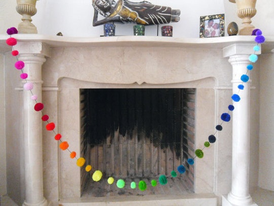
We also love this happy garland from Midget Gems featured on Apartment Therapy:

(via Apartment Therapy)

Your table settings and centerpieces are an easy opportunity to add color. For Jill's holiday place settings, we set out a bowl of bright Christmas balls and then carried the color through the ribbons tied around the napkins:


We tucked an air plant under the ribbon as a modern alternative to the traditional fir tree clipping.

Two DIY projects add some extra fun to our decorations. On the kitchen wall, we hung an original art piece created by Lauren Hosmer from our team.


Lauren glued mini-cookie cutters together (get out your glue gun!) and then painted some of the interiors with red acrylic paint. After hanging the piece with clear fishing line, she inserted a few air plants for a funky touch.

Lauren also created the dramatic vases on the living room table:


Lauren transformed simple wine, Perrier and sake bottles using acrylic paint and painter's tape. (Hint: remove the labels from the bottles and paint the white layer before adding the colorful stripe!) 

What's your current holiday color scheme? Do you have a favorite Holiday DIY? Share them with us in the comments below!

Saturday, November 10, 2012

Book Review: Home by Novogratz

We just picked up the new design book Home by Novogratz, and boy are we glad we did! This book is chock-full of great ideas, tips and photos -- providing a feast for your right brain as well as practical information for your left side.


You gotta love the cover photo -- complete with the dimpled smirks of Cortney and Robert and all seven of their kids! For those of you not familiar with this dynamic design duo, the Novogratzes host their own HGTV show, Home by Novogratz, and also have a line of furniture and accessories right now in CB2. Their signature style is a modern/vintage mix, with bold accents -- most often in lighting and artwork.


I love how this book is organized. Each chapter is dedicated to one design project, and they share the budget, the goal and the client's wish list so you can really understand why they do what they do. They begin with a large photo of "Where we started" (i.e., the "Before") and end with a "Where we ended" ("After") photo. Cortney and Robert take readers through the major steps of each project, complete with photos and snappy little tips.


Each chapter also includes user-friendly info graphics like the one below.


And you even get a line-by-line breakdown of exactly how they spent the client's budget. This is a great added bonus that most designers don't share.

Here are some more treats from the book. Check out this fireplace transformation!


In this photo you see one of the Novogratzes' signature tricks: mismatching the dining room chairs -- choosing highly contrasting armchairs vs. side chairs.


How amazing is this room, created for triplets? Playful wall art (custom wall paper) and colorful lighting are also a sure sign that this room was Novogratzed.


This may be my favorite of all the excellent design books that have rolled out this past year. It has just the right balance of photography and information, and it's organized and easy to follow. If you want to be inspired and informed without being overwhelmed, this book is for you!

Friday, September 28, 2012

How we use color throughout a home

We staged a home this week that is a great example of how to carry a color palette throughout a home.

When we decorate a home (or even just a room), we begin by creating a color palette. This palette includes the wall paint colors, as well as the pops of accent colors we will use in furniture and decor. For our recent project, we created a palette of yellow, greens and blues, with gray and white acting as our neutrals.

Tip: when you're creating your palette, don't forget to take into account the color of the floors and any existing trim or woodwork. This home featured dark wood floors.

We used the yellow downstairs in the living room rug and on the kitchen/dining room walls, and then carried it upstairs on an accent wall in the office area.


We featured green on the upstairs wall, on the kids' room walls (photo below), and in pieces such as rugs, artwork and books throughout the home.


Note the pops of yellow in this room as well!

And we chose blues as accent walls in the master and guest bedrooms.


In the master, note how the pillows, artwork, rug, pouf and throw all introduce different, yet complementary, blues.


In the guestroom, you can just see a sliver of the blue accent wall; notice that yellow features prominently in the room as well.

Even the home's exterior showcased our palette!


Note the peppy yellow door.

One of our slogans is "add some color to your life" -- and this house shows exactly how we like to do that!