The global/ethnic craze that started a couple of years ago with Ikat fabric and Moroccan rugs is still going strong -- and we are glad! Check out the new book by Australian designer Sibella Court, Nomad: a global approach to interior style. It's packed with textures, patterns and colors from around the world, all incorporated in brilliant ways within the home.
This book it truly a feast for your eyes, and inspirational beyond belief. It's making us look at our artifacts in new ways. And even if you've never traveled farther than the next state, you can find global treasures in antique stores and flea markets everywhere.
The new West Elm catalog, called roads less traveled, features goods handmade in Morocco.
The photos are breathtaking and just invite you to jump into these rich colors and luxurious textures.
Of course, it's always great to see how real people incorporate these trends within their own homes. The new Elle Decor features the space of designer Steven Johanknecht. Look how he carefully combines the kilim rug, a throw from Mexico, Navajo-inspired pillows, and raw wood.
And his outdoor space is just as inviting, with an eclectic mix of copper bells, colorful pillows and bright globe lights.
Yesterday we found our own great example of a global-chic Indian-inspired pillow at Nest, a unique boutique on Fillmore in San Francisco. We love the little shells at the corners and the tiny mirror sewn in the middle.
What do you have hidden away in your cupboards that might make interesting decor? Textiles, knick-knacks and ceramics from your travels might be just what you need to bring more individuality to your home.
Thursday, February 23, 2012
Wednesday, February 15, 2012
Loving a Little Lavender!
As much as we love bold, bright colors, we appreciate the power of more soothing hues too. Right now we're noticing lavender -- everywhere we look.
The cover home in the February 2012 issue of Elle Decoration UK features the iconic Egg chair and a simple pillow in lavender.
And the relatively new HGTV magazine showcased a beautiful lavender sofa in a recent story.
Even Ikea is showing the lavender love via their Isala laptop table:
In our own home, our cozy lavender cashmere scarf has been keeping us warm. Here it's shown with a vintage Takahashi laquer tray we just picked up at the Alameda Flea Market. Love the contrast of the orange with the lilac!
And the vintage stools we sit on every day in our office (also from Alameda Flea) have subtle lavender cushions.
Don't be afraid to combine this soothing shade with brighter elements, as we've done above. It's the mix that makes it fun.
Photo from think Color by Tricia Guild, still one of our favorite books.
The cover home in the February 2012 issue of Elle Decoration UK features the iconic Egg chair and a simple pillow in lavender.
And the relatively new HGTV magazine showcased a beautiful lavender sofa in a recent story.
Even Ikea is showing the lavender love via their Isala laptop table:
In our own home, our cozy lavender cashmere scarf has been keeping us warm. Here it's shown with a vintage Takahashi laquer tray we just picked up at the Alameda Flea Market. Love the contrast of the orange with the lilac!
And the vintage stools we sit on every day in our office (also from Alameda Flea) have subtle lavender cushions.
Don't be afraid to combine this soothing shade with brighter elements, as we've done above. It's the mix that makes it fun.
Saturday, February 11, 2012
Color Trends for 2013
Last week we attended the Color Pulse 2013 presentation at the Benjamin Moore showroom in the San Francisco Design Center. These yearly Color Pulse shows give a fun preview of what colors will be most prominent in the design world for the year ahead.
The theme for 2013 is Intersection, broken down into four categories: Interflow, Intercycle, Interanimate, and Interconnect. The colors are inspired by art, design and architecture from around the world, and have three-dimensional references within each group.
Interflow is all about reintroducing colors and textures of the past in a new and modern way, retaining what is comfortable and familiar. Think colorful chunky knit pillows and quilts made in a fresh way.
Intercycle refers to upcycling “disposable” materials, repurposing elements through unusual pairings of color and material. Some examples are structures made out of old tires, and artwork from discarded license plates.
Interanimate is about play – using bold and dynamic color to escape the everyday life and connect with our inner child. This category is inspired by bright legos, marbles, and comic books.
Finally, Interconnect explores the juxtaposition of what is virtual vs. what is real. Color strikes a path through the virtual, illuminating the familiar and material world. Think digital photography and computer graphics.
So what colors will be "hot" in 2013? According to Benjamin Moore:
And what colors won't be popular next year?
So what colors will be "hot" in 2013? According to Benjamin Moore:
- Reds -- those that are sophisticated, with blue undertones
- Pinks -- both soft and feminine and bright pinks
- Oranges -- deep corals and camel tones
- Yellows -- when offset by red and oranges
- Greens -- darker kelly green and very pale green
- Blues -- watery blues, soft blues are starting to trend (influenced by popular website colors)
- Purples -- smokey, almost mauvey, purples
- Neutrals -- animal prints contrasted with bright colors
And what colors won't be popular next year?
- Black and white -- this harsh contrast is going away
- Metallics.
It will be fun to see how these predictions play out!
Friday, February 3, 2012
Bringing Color to the Table
This week we spent some time in Ikea, where the Reidar chair really caught our eye. It comes in 4 colors, including this vibrant blue -- and it's a great deal at $49.99.
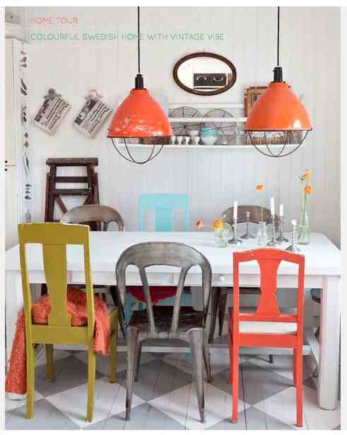
It's no secret that we love color, so the idea of bright chairs around the dining or kitchen table really appeals to us. You can even mix an assortment together for a really fun look, as shown here:
image via Pinterest via Summer Allen
If you want to achieve this look in your home, here are some other great options for colorful chairs in stores and online right now.
These are both from CB2: the Echo Orange Chair is $89.95 and the Fleet chartreuse chair is on sale for $129 (regularly $149).
If you're ready to make more of an investment, Design Within Reach offers the 111 Navy Chair for $260; or the Era Round Armchair for $225 (both chairs are available in other fun colors too).
And for a nice shot of Kelly green, try the Ming Green side chair from Crate and Barrel, $199.
Thursday, January 26, 2012
One Love: White Pottery
Nothing looks more fresh than bright white pottery. We especially like to mix matte and glossy whites with glass and silver. No matter what your budget is, you can find the right white piece for you.
For example, all of the vessels shown in the grouping below are available at West Elm, and prices start as low as $10 for the small bud vases.
If you're ready to make more of an investment, Jonathan Adler is a great source for fun, funky shapes and textures. We have the Pinch bowl and the Belly Vase on our coffee table.
And for a different look, on our console we've grouped the Platinum Abacus vase from Jonathan Adler, a tall textural white vase from Room Service, and a CB2 black-and-white vase (no longer available). They are a good complement to our Geneva sound system.
There are many other options for incorporating white into your styling -- look for white arts-and-crafts pottery (like the McCoy piece below) or vintage white enamel pitchers at flea markets. These look great next to more modern pieces.
Ikea offers three sizes of white enamel pitchers for bargain prices. Just fill with some bright orange gerber daisies and you're all set.
For example, all of the vessels shown in the grouping below are available at West Elm, and prices start as low as $10 for the small bud vases.
If you're ready to make more of an investment, Jonathan Adler is a great source for fun, funky shapes and textures. We have the Pinch bowl and the Belly Vase on our coffee table.
And for a different look, on our console we've grouped the Platinum Abacus vase from Jonathan Adler, a tall textural white vase from Room Service, and a CB2 black-and-white vase (no longer available). They are a good complement to our Geneva sound system.
There are many other options for incorporating white into your styling -- look for white arts-and-crafts pottery (like the McCoy piece below) or vintage white enamel pitchers at flea markets. These look great next to more modern pieces.
Ikea offers three sizes of white enamel pitchers for bargain prices. Just fill with some bright orange gerber daisies and you're all set.
Wednesday, January 18, 2012
Decorating with Books
Despite all the cool e-readers and tablets that have popped up in the last few years, nothing can replace a real, paper-and-cardboard book. If you look around our homes and office it's easy to see how much we love books. This can become a decorating problem -- how do you organize and store your books without bringing clutter into your space?
Sometimes the best thing to do is just embrace the different colors and sizes of your books and let them play a part in an eclectic, haphazard and lively decorating scheme, as in this photo from an anthropologie catalog:
You can also play around with the colors of your book spines, grouping them together by color or contrasting the brights against the more neutral. In this fun space from HouseBeautiful, a stack of colorful books really pops against this fabulous black-and-white book wallpaper!And neutral books look great when combined with other white, tan and silver objects inside this white cupboard.
Sometimes the best thing to do is just embrace the different colors and sizes of your books and let them play a part in an eclectic, haphazard and lively decorating scheme, as in this photo from an anthropologie catalog:
You can also play around with the colors of your book spines, grouping them together by color or contrasting the brights against the more neutral. In this fun space from HouseBeautiful, a stack of colorful books really pops against this fabulous black-and-white book wallpaper!(image via TineK via decor8)
We always incorporate books in Visual Jill decorating projects -- stacked up as a perch for other objects, or placed strategically to bring just the right color to a certain spot.
Don't overlook the decorating power of a book!
Thursday, January 12, 2012
Mad about Tangerine Tango
Pantone's 2012 Color of the Year -- Tangerine Tango -- has been making quite a splash in the design world.
Here at Visual Jill, we've always loved this vibrant orange-red -- just look at our logo, above. Last week we were so inspired that we actually painted our dining room wall Benjamin Moore's Orange (2011-10). It adds such energy to the room!
Of course, our affection for orange doesn't stop there! We restyled our couch with some new pillows too.
And elsewhere . . . we've infused some Tango into our entryway via pillows, artwork, a throw and a scarf . . .
. . . and brought the brightness to our kitchen through a new teapot and our favorite barstools!
The Tangerine Tango craze is showing up all over the blogosphere and print publications. Last Sunday's San Francisco Chronicle Style section focused on the hue, and the Note to Self blog pulled together a sampling of tangerine goodies too.
We're so glad the world is embracing this sunny, optimistic color. We think it's here to stay!
Here at Visual Jill, we've always loved this vibrant orange-red -- just look at our logo, above. Last week we were so inspired that we actually painted our dining room wall Benjamin Moore's Orange (2011-10). It adds such energy to the room!
Of course, our affection for orange doesn't stop there! We restyled our couch with some new pillows too.
(Gold, orange and black/white pillows from CB2, Faces pillow from Erica Tanov, orange side table from CB2)
(Pillows from CB2 and BoConcept)
. . . and brought the brightness to our kitchen through a new teapot and our favorite barstools!
(Tea kettle from Le Creuset, Jam Lift barstools from KCC Living)
The Tangerine Tango craze is showing up all over the blogosphere and print publications. Last Sunday's San Francisco Chronicle Style section focused on the hue, and the Note to Self blog pulled together a sampling of tangerine goodies too.
Wednesday, January 4, 2012
Diamonds are a decorator's best friend
Bold graphic diamond patterns are hot in the home decorating world right now. The British Ideal Home magazine called out this trend in its November 2011 issue, and we're now seeing diamonds everywhere.
We just purchased the frizzle pillow from CB2 -- and we love how it looks next to our funky retro diamond flea market lamp.
We also love the Chicago building prints from CB2, featuring abstract photographs of famous architecture from the windy city that look like geometric shapes.
Over at West Elm, the Souk Rug and the Embroidered Diamond Links pillow offer other interpretations of the diamond trend.
We say -- invest in diamonds this winter!
We just purchased the frizzle pillow from CB2 -- and we love how it looks next to our funky retro diamond flea market lamp.
We also love the Chicago building prints from CB2, featuring abstract photographs of famous architecture from the windy city that look like geometric shapes.
Over at West Elm, the Souk Rug and the Embroidered Diamond Links pillow offer other interpretations of the diamond trend.
We say -- invest in diamonds this winter!
Thursday, December 22, 2011
Happy Holidays
All of us at Visual Jill wish you and your loved ones a wonderful holiday season. This photo from the late 50's shows Jill (left), her older sister Julie, and her lovely mom Brita, who passed away this past May. We'll be thinking of her on Christmas Eve, when her family will open presents and eat lutefisk -- a Norwegian tradition.
May your days be filled with family, friends and peace.
Thursday, December 15, 2011
A Festive Holiday Table
Setting the table for guests is perhaps our favorite part of holiday decorating. It's so fun to put all the pieces together -- the place settings, place mats, and of course the centerpiece. For our own holiday table this year we chose to balance bright colors with natural elements, along with a bit of gold (to compliment the rest of the decor in the house).
We found our fabulous succulent centerpiece at Flowerland, and placed it over a runner made from a folded piece of gold fabric. Then we lined up simple colored balls along the base of the wooden box.Our place mats are thick felt circles in the same bright colors, and we used simple white Norwegian plates that Jill inherited from her mom. The silver is also from Jill's family. It's always special to incorporate some family tradition.
This photo shows the delicate pattern on the plates, and the colorful eclectic ornaments we used as napkin rings.
There are so many other great ideas out there in design blogs and magazines. Here are some of our favorites:
Pinecones become tiny trees when put in silver cups and topped with a star! (via kirtsy, from Good Housekeeping)
White and green are always a powerful combination. (via lolalina, via Fryd + Design)
Old funnels make beautiful candle holders, especially when placed on antique lace. (via Poppytalk, via Sjarmermende Gjenbruk)
And what could be cuter than using alphabet soup letters for your placecards? (from lolalina via Oh Happy Day)
We found our fabulous succulent centerpiece at Flowerland, and placed it over a runner made from a folded piece of gold fabric. Then we lined up simple colored balls along the base of the wooden box.Our place mats are thick felt circles in the same bright colors, and we used simple white Norwegian plates that Jill inherited from her mom. The silver is also from Jill's family. It's always special to incorporate some family tradition.
This photo shows the delicate pattern on the plates, and the colorful eclectic ornaments we used as napkin rings.
There are so many other great ideas out there in design blogs and magazines. Here are some of our favorites:
Pinecones become tiny trees when put in silver cups and topped with a star! (via kirtsy, from Good Housekeeping)
White and green are always a powerful combination. (via lolalina, via Fryd + Design)
Old funnels make beautiful candle holders, especially when placed on antique lace. (via Poppytalk, via Sjarmermende Gjenbruk)
And what could be cuter than using alphabet soup letters for your placecards? (from lolalina via Oh Happy Day)
Subscribe to:
Posts (Atom)